Is Your Website Making Visitors Think Too Hard? The Hidden Cost of Cognitive Load
Imagine you walk into a store looking for a simple black t-shirt. Instead of neat aisles, you’re met with piles of clothes, confusing signs, and loud, distracting music. You can't find what you need, you feel overwhelmed, and you walk out.
That feeling of frustration and mental exhaustion? That’s cognitive load. And there’s a good chance your website is creating that exact experience for your visitors right now.
Your landing page isn't just a digital brochure; it's a conversation. But if that conversation is confusing, cluttered, or demanding, your visitors will leave often for good. In fact, research shows that 88% of online consumers are less likely to return to a site after a bad experience.
In this guide, we'll explore what cognitive load is, why it's the silent killer of conversions, and how you can use simple design principles within Webflow to create a smoother, more intuitive experience that guides visitors effortlessly toward "yes."
What Is Cognitive Load, Really?
Cognitive load is the total amount of mental effort required to use a product, in this case, your website. Think of it as your brain's available RAM. Every element on your page—every image, piece of text, button, and animation uses up some of that RAM. If you overload it, the system crashes. The visitor gets frustrated, confused, and clicks away.
Two key psychological principles are at play here:
- Miller's Law: In the 1950s, psychologist George Miller found that the average person can only keep about seven (plus or minus two) items in their working memory at a time. When your navigation has 15 options or you present ten different calls to action, you're directly fighting against the natural limits of the human brain.
- Hick's Law: This law states that the time it takes to make a decision increases with the number and complexity of choices. A landing page that asks a visitor to "Watch Our Demo," "Download the eBook," "Sign Up for a Newsletter," and "Read Our Blog" all at once creates decision paralysis.
The goal isn't to eliminate thinking entirely, but to direct it. You want visitors using their mental energy to understand your value proposition, not to figure out how to use your website.
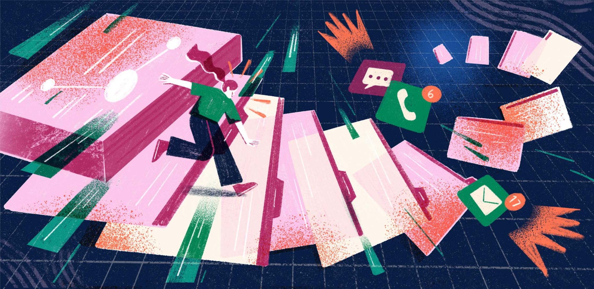
The Telltale Signs of a High Cognitive Load Website
Does your website suffer from any of these common conversion-killers? When nearly half (46%) of visitors judge a company's credibility based on website design, these issues can be devastating.
- The Wall of Text: Long, unbroken paragraphs that look like a page from a textbook. Users don't read online; they scan. A wall of text is an instant "I don't have time for this" signal.
- Choice Paralysis: Too many buttons, links, and options competing for attention. If everything is important, nothing is.
- Visual Clutter: A lack of whitespace, inconsistent fonts and colors, and too many competing images or graphics. This creates a sense of chaos and makes it impossible to focus. According to Adobe, 38% of people will stop engaging with a website if the content or layout is unattractive.
- Confusing Navigation: Vague labels ("Solutions," "Resources") or a navigation bar that changes from page to page. This forces users to relearn your site structure with every click.
These aren't just minor design flaws. They are roadblocks that add friction to the user journey, and that friction costs you leads and sales.
3 Ways to Reduce Cognitive Load on Your Webflow Landing Page
The beauty of using a platform like Webflow is that you have granular control over the user experience. Here are three actionable strategies you can implement to create a clearer, more persuasive landing page.
1. Create a Clear Visual Hierarchy
Visual hierarchy is about arranging elements to show their order of importance. It tells the user's eye where to look first, second, and third.
- Use Size and Scale: Your most important message your value proposition should be the biggest and boldest text on the page. Use H1, H2, and H3 tags not just for SEO, but to create a logical flow for scanners.
- Leverage Whitespace: Whitespace (or negative space) is the empty area around elements. It’s not wasted space; it’s an active design tool. Use it to group related items and separate unrelated ones. This reduces clutter and improves comprehension by up to 20%.
- Strategic Color and Contrast: Use a limited, consistent color palette. A bright, contrasting color should be reserved for your primary Call-to-Action (CTA) button to make it pop. This simple visual cue tells users, "This is the most important action you can take here."
A well-planned design is the foundation. Turning a clear design into a functional website is a critical step, and our expertise in the Figma to Webflow process ensures that the strategic hierarchy you designed is perfectly executed on the live site.
2. Chunk Your Information
Remember Miller's Law (7 +/- 2)? "Chunking" is the practice of breaking down your content into small, easily digestible pieces to respect this cognitive limit.
- Short Paragraphs: Keep paragraphs to 2-3 sentences maximum. This makes the content feel less intimidating and easier to scan.
- Bulleted Lists: Whenever you're listing features, benefits, or steps, use a bulleted or numbered list. This format is instantly scannable and helps users absorb information quickly.
- Group Related Content: Use cards, boxes, or distinct sections with clear headings to group related information. For example, have a dedicated "Features" section, a "Testimonials" section, and a "Pricing" section. This creates a predictable and easy-to-follow structure.
3. Simplify Choices and Messaging
Your landing page should have one primary goal. Every element on the page should support that single goal.
- One Primary CTA: Decide on the single most important action you want a user to take and make that your primary CTA. Any secondary CTAs (like "Learn More") should be visually subordinate a text link or a ghost button.
- Write Clear, Concise Copy: Ditch the jargon and corporate-speak. Write like you talk. Instead of "Leverage Synergistic Paradigms," say "Work Better Together." Your headline should clearly state what you do and for whom.
- Ensure Blazing Fast Speeds: A slow-loading website adds "temporal load" the frustration of waiting. Studies show that even a 1-second delay in page load time can result in a 7% reduction in conversions. A fast site feels effortless. This is why prioritizing fast Webflow development is essential for keeping user frustration low from the very first moment.
A low-load site isn't just about the initial build; it's about keeping it clean and efficient over time. Clutter can creep back in as you add new content. A plan for ongoing Webflow maintenance is crucial for ensuring your user experience remains top-notch.
Your Path to a Clearer Website Starts Now
Reducing cognitive load isn't about "dumbing down" your content. It's about being respectful of your visitor's time and attention. It’s about removing unnecessary friction so they can focus on the value you offer.
By implementing a strong visual hierarchy, chunking your content, and simplifying choices, you can transform your Webflow landing page from a confusing maze into a clear, compelling path to conversion. Start by looking at your own page through the eyes of a first-time visitor. Where is the friction? What's making them think too hard?
Answering those questions is the first step toward building a website that doesn't just look good, but feels good to use.
Frequently Asked Questions (FAQ)
What is cognitive load in the simplest terms?
It’s the mental effort a visitor has to use to understand and navigate your website. The more effort required, the higher the load, and the more likely they are to leave. The goal is to make using your site feel intuitive and easy.
Why is whitespace so important in web design?
Whitespace, or negative space, is the empty area around elements on your page. It's crucial because it reduces visual clutter, improves readability, and helps guide the user's eye to the most important content. It gives your content room to breathe.
How many calls-to-action (CTAs) should I have on my landing page?
Ideally, one primary CTA. This is the main action you want users to take (e.g., "Start Free Trial"). You can have secondary, less prominent CTAs (e.g., "Learn More"), but your main goal should be crystal clear and visually dominant to avoid confusing the user.
Is reducing cognitive load something I can fix myself in Webflow?
Absolutely. Webflow gives you the tools to manage many of these principles. You can easily adjust spacing for whitespace, change font sizes to create hierarchy, and edit copy to be more concise. The key is knowing which principles to apply and looking at your site with a critical eye for clarity.