Your Webflow Landing Page is Leaking Conversions. Here’s How to Fix It With Trust.
You have five seconds.
That’s about how long you get before a new visitor decides whether to trust your website or hit the back button. In that flash of a moment, they aren’t reading your carefully crafted copy or admiring your animations. They’re making a gut decision based on a constellation of tiny cues.
Is this site legitimate? Is my information safe here? Does this feel… right?
If you’re using Webflow, you have the power to build visually stunning, technically robust websites. But all that power is wasted if you can't pass that initial five-second trust test. Many businesses focus on optimizing button colors and headlines, overlooking the single most important foundation of conversion: credibility.
This isn't just about adding a few logos to your footer. It's about architecting an experience of trust from the moment the page loads. Let’s move beyond the basics and explore how to weave credibility into the very fabric of your Webflow landing page.
The Trust Signal Toolkit: Your Conversion Essentials
Before we dive into the “how” in Webflow, let’s define the “what.” Trust signals are the elements on your page that communicate legitimacy, security, and authority to your visitors. Think of them as a collection of evidence that proves you’re a safe and smart choice.
Based on our analysis of top-performing landing pages and conversion rate optimization (CRO) principles, we can group these signals into four essential categories:
- Social Proof: This is the wisdom of the crowd. It shows visitors that other people, just like them, have trusted you and had a positive experience.
- Examples: Customer testimonials, case studies, user reviews, star ratings, and embedded social media posts.
- Authority Signals: These demonstrate your expertise and credibility within your industry. It answers the question, "Why should I listen to you?"
- Examples: "As Seen On" media logos, partner or client logos, industry certifications, and awards.
- Security & Safety Guarantees: These signals directly address a visitor's security and privacy concerns, assuring them that their data and investment are safe.
- Examples: SSL certificates, secure payment badges (Visa, PayPal), clear privacy policy links, and money-back guarantees.
- Commitment & Consistency: This is about professionalism. A polished, bug-free website demonstrates a commitment to quality that inspires confidence.
- Examples: A well-designed UI, fast page load speeds, and clear, error-free copy.
From Theory to Practice: Building Trust Signals in Webflow
Knowing what trust signals are is one thing. Implementing them effectively inside the Webflow Designer is another. Here’s how to build these crucial elements for maximum impact.
Mastering Testimonials That Actually Convert
Generic, glowing testimonials like "Great service!" are easily ignored. Research from CRO experts at Unbounce shows that visitors are often skeptical of perfect, polished reviews. True credibility comes from authenticity and detail.
An effective testimonial should be specific, highlighting a tangible outcome or a problem solved. It needs to feel like it came from a real person.
How to Implement in Webflow:
- Static Sections: For 1-3 powerful testimonials, a static section built with Flexbox or Grid is perfect. Ensure each testimonial includes a high-quality headshot, the person’s full name, their company/title, and the specific quote.
- CMS-Powered Sliders: If you have many testimonials, use Webflow’s CMS to create a dynamic slider. This keeps your page clean while showcasing a wealth of social proof. You can build a collection for testimonials and bind the photo, name, and quote fields to elements within your slider.
- Third-Party Widgets: For services like Trustpilot or Google Reviews, you can use an HTML embed element in Webflow to display dynamic, verified reviews directly on your page.
[Image: A beautifully designed testimonial section on a Webflow page, showing a photo, name, company, and a specific, impactful quote.]
Pro-Tip: Reach out to your best customers and ask them targeted questions like, "What was the single biggest challenge we helped you solve?" or "What specific result did you see after working with us?" to get quotes that are rich with detail.
Displaying Authority with Logos and Certifications
When a visitor sees logos of companies they know and trust on your page, that trust is transferred to you. This is called the "halo effect." But a messy, pixelated grid of logos can do more harm than good.
How to Implement in Webflow:
- Create a Clean Logo Wall: Use a simple Grid or Flexbox layout to ensure your client or partner logos are perfectly aligned and spaced.
- Standardize Your Visuals: For a polished look, use a tool to convert all logos to a single color (like grayscale) and ensure they are all high-resolution SVG or PNG files with transparent backgrounds. This creates visual harmony and prevents your page from looking cluttered.
- Strategic Placement: Your "As Seen On" or "Trusted By" section works best just below the hero section or above the final call-to-action to reinforce credibility before a decision is made.
[Image: A clean 'As Seen On' logo strip featuring well-known brand logos, perfectly aligned and greyscaled for visual consistency.]
Showcasing Security and Guarantees
Every time a visitor is asked to provide an email or payment information, a small moment of hesitation occurs. Your job is to eliminate that friction with clear security signals.
How to Implement in Webflow:
- Payment & Security Badges: Place logos like Visa, Mastercard, PayPal, and Norton Secured directly below your call-to-action buttons or near payment forms. This is a visual shortcut that screams "your information is safe here."
- The Footer Trust Hub: Your website’s footer is the perfect place for foundational trust elements. Ensure you have clear, accessible links to your Privacy Policy and Terms of Service. Webflow’s powerful hosting automatically includes a free SSL certificate, but you can reinforce this by adding a small lock icon and "Secure SSL Encryption" text in your footer or near forms.
- Design Your Guarantee: Don't just write "30-Day Money-Back Guarantee." Design it. Create a distinct section with an icon (like a shield or ribbon) and clear, simple language explaining the terms. This visual emphasis makes the promise more tangible and impactful, a key factor even on projects requiring rapid development without compromising quality.
Beyond the Basics: Advanced Trust-Building Strategies
Once you have the foundational elements in place, you can elevate your landing page with more nuanced psychological triggers.
The Power of Trustworthy Microcopy
Microcopy is the small text on buttons, forms, and alerts that guides the user. You can use it to preemptively answer questions and ease concerns.
- On a Form Field: Instead of just a placeholder for "Email Address," add a small line of text below it that says, "We respect your privacy and will never share your email."
- On a CTA Button: Instead of a generic "Submit," try "Get Your Free Quote Now" or "Start My 7-Day Free Trial." Be specific about what happens next.
[Image: A before-and-after comparison of a landing page CTA button. 'Before' is a generic 'Submit' button. 'After' has the button, security lock icons, and microcopy like '100% Secure Transaction'.]
The Psychology of 'Imperfect' Proof
As mentioned earlier, perfection can be suspicious. A product with thousands of 5-star reviews can sometimes feel less real than one with a 4.8-star average that includes a few detailed 4-star reviews. Don't be afraid to show a slightly imperfect but more realistic picture. This authenticity builds a stronger, more resilient form of trust.
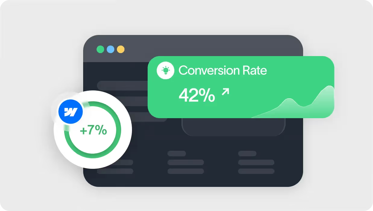
The Ultimate Trust Signal: Flawless Execution
The most powerful trust signal isn't an element you add it's the quality of the page itself. A website that loads instantly, has no broken links, and looks pixel-perfect on every device communicates a deep commitment to quality. This is where expert Webflow development becomes a non-negotiable asset. Every detail, from responsive design to clean interactions, works together to create an unspoken sense of professionalism and reliability.
Frequently Asked Questions About Landing Page Trust
Can you have too many trust signals?
Yes. A page overloaded with badges, pop-ups, and logos can feel desperate and spammy, which has the opposite effect. Focus on the most impactful signals for your audience and integrate them cleanly into your design. Prioritize quality over quantity.
Where is the best place to put testimonials?
Place your most powerful testimonial near the top of the page, close to your primary headline and call-to-action. Additional testimonials can be placed in a dedicated section further down the page to provide more depth for visitors who are still exploring.
How do I make my social proof look authentic?
Use real photos of your customers, not stock images. Include their full name and company (with their permission). Most importantly, use specific, outcome-oriented quotes instead of generic praise.
Does my website's speed affect trust?
Absolutely. A study by Google found that 53% of mobile users abandon a site that takes longer than three seconds to load. A slow website feels unprofessional and insecure, causing visitors to lose confidence before they even see your content.
Your Next Step: From Learning to Doing
Building a high-trust landing page isn't a one-time task; it's a commitment to seeing your website through your visitors' eyes. By implementing these strategies, you can transform your Webflow page from a simple digital brochure into a powerful conversion engine built on a foundation of credibility.
Ready to build a website that inspires confidence from the first click? See how our client-centric Webflow development process turns ambitious designs into high-trust, high-performance online experiences.